How to change image scaling?
Option imageScaleMode is applied to an image inside slide that has class rsImg, or to img element that is a root element of a slide.
In WordPress version image scaling can be changed in "Image Options" section.
Image scale types:
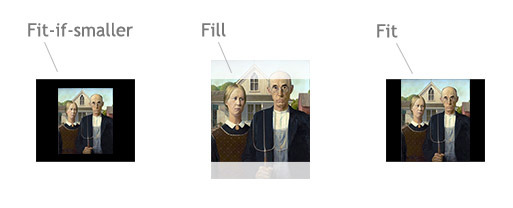
fit-if-smaller(default) scales image to fit only if the size of slider viewport is less than size of an image.fitsame as above, but enlarges an image if it's smaller then viewport.fillscales image to completely fill slider viewport.nonedoesn't change size of an image.
All options maintain aspect ratio of an image. Option imageScalePadding sets minimum distance from slider edges to image and works only with fit or fit-if-smaller types, default value is 4 (px).
Aligning to center
By default, all slider images are aligned to center, To disable this set `imageAlignCenter: false`.To center image only horizontally but keep fixed margin from the top you may use CSS:
.rsImg { margin-top: 20px !important; }
Resize image manually only via CSS
To do this disable imageScaleMode and imageAlignCenter and apply CSS that you need, for example:
imageScaleMode:'none',
imageAlignCenter:false
.royalSlider img {
    width: 100%;
    height: auto;
    margin: 10px auto;
}
If you won't add rsImg class to an image - RoyalSlider will not do anything with it and will ignore preloading and scaling options.
In WordPress version image scaling and centering can be disabled in "Image Options" section.
Changing size of slider viewport
Viewport width (slider width) can be changed via CSS, e.g. .royalSlider { width: 100% } (in WordPress version, you may just set 100% in Width option of Size & Scaling section).
Viewport height (slider height) can be changed by autoScaleSlider option (or via CSS if it's disabled, auto is not supported), for example if you use:
autoScaleSlider: true,
autoScaleSliderWidth: 2,
autoScaleSliderHeight: 1
... height of a slider will be two times less than the width. Or if you set values to 1024 and 768, slider will scale height so it always remains at this ratio.
In WordPress version, auto scale slider options are in Size & Scaling section
Also note, that even if autoScaleSlider is enabled, you can force height via CSS, for example:
/* Set height of slider to 350px when size of window is less than 500px */
@media all and (max-width: 500px) {
   .royalSlider  {
      height: 350px !important;
   }
}
Slider viewport size can also be reduced by thumbnails. To disable this, set option thumbs: { fitInViewport:false }, and thumbnails will be placed below the viewport, not inside of it.
To scale height of the slider based on the content of a slide there is an auto-height option, use it like so:
autoHeight: true,
autoScaleSlider: false,
imageScaleMode: 'none',
imageAlignCenter: false
Dynamically changing imageScaleMode and imageAlignCenter
If you're using v9.5.7 or above (you can get latest one from build tool): you just need pass function instead of string in image scaling options:
imageScaleMode: function(slideObject) {
    console.log(slideObject); // slideObject contains data about slide
    return 'fill';
}
Same can be done to imageAlignCenter, it just should return true or false.
Note that imageScaleMode applies during the initialization or when browser resizes, to force it execute yourSliderInstance.updateSliderSize(true) method.